Email LinkedIn Twitter

Behind the Scenes of Viral Video Award-winner Ticknado

By Dacia Daly, TickEncounter TickSmart Social Media intern


Have you heard of “Sharknado?” If you haven’t, here’s a quick introduction: “Sharknado” is a made-for-TV horror movie about a  freak hurricane that lifts sharks out of the ocean and throws them into LA.  Sound too far-fetched? Well, not only did last summer’s hilariously bad trailer go viral but “Sharknado 2” was just released. Check out the trailer below (it’s really too funny to pass up!) to see exactly what I’m talking about.

‘Sharknado’ – Ticknado’s Inspiration!

Ticknado – Be Prepared!


The silly subject matter of the movie got people talking, which caused the video to be a hit on Twitter. The trailer was primarily the only marketing for the movie, but it sparked so much interest that it became one of SyFy’s most successful films ever.

The TickEncounter social media team saw this, and wanted to get a piece of the action. So, we decided to make our own “ticky” version of the movie: Ticknado! When we were first presented with the idea, I was a little hesitant. How could we make ticks as scary as sharks, and how much would my acting skills (or lack there-of) affect our film?

Luckily, my worries were for nothing. Sue broke the ice by dressing up as a giant tick and her enthusiasm was contagious. The other student interns really got into their “characters” and made acting like we were caught in a storm of ticks a fun experience.  Actually, my favorite part of making the film was watching all of our mistakes. Who doesn’t love the bloopers? When we were shown the final product, I was excited about what we had created. I truly felt that we’d turned normally “boring” or “gross” material into an entertaining short film.

The social media team, along with Dr. Tom Mather, and TickEncounter’s Director of New Media Brian Mullen created Ticknado with the goal of increasing awareness about tick-disease and prevention. Apparently, it worked!  Ticknado recently won the award for the 2013 Viral Video from Strategic Video’s Awards. The Strategic Video awards judge videos on the effectiveness of their message instead of pure video quality.

I believe that the viral quality of the video is due to the entertaining nature of the film. Unlike most public service announcements, Ticknado presents normally dry information with a humorous twist. While there are few people who would share a video about tick facts, people love to find and share funny videos.  Hopefully, Ticknado will follow the huge viral trend of its inspiration Sharknado.


[social_share style=”circle” align=”horizontal” heading_align=”inline” text=”Behind the Scenes of Viral Video Award-winner Ticknado — Even Scarier than Sharknado @TheTickGuy @TickEncounter @NewMediaStrategist” heading=”Insightful? Share with your followers now” facebook=”1″ twitter=”1″ google_plus=”1″ linkedin=”1″ pinterest=”1″ /]


What does it take to go viral? Is it even worth trying? Share your thoughts and insights with a quick comment.


[cta id=”4888″ align=”none”]

i WED: SXSW on marrying writing, editing, designing

Unifying your content in a multimedia era

We’ve all heard the expression, “Don’t judge a book by its cover,” but when viewers look at your webpage, app, and yes, even book, they instantly judge whether it’s worth their time to continue reading or not. That’s why it’s imperative that your writing, editing, and design are presented as a package that represents what you want it to.

At this year’s South by Southwest conference, Roy Peter Clark – writer, editor, teacher, and writing coach – and Mario R. Garcia – newspaper and magazine designer – presented on the way you should “wed” these three aspects of presentation with their session, i WED (writing, editing, designing).

One of the most important principles of creating well-designed content is to start with the blank page and design and write together, according to Clark and Garcia. Don’t simply write the text and add design elements afterward or you will lose valuable opportunity to make your content an experience rather than just some words and a picture.

It would be like watching a movie with no music and minimal settings. To tell a story with emphasis, you have to consider all parts with equal care.

Techniques and elements to consider

  • Making content design functional and intrinsic
  • Storyboarding ahead of time, and not repeating content
  • Planning key points and emphasizing them using design elements
  • Using white space as punctuation to create emphasis and tension
  • Creating an interesting dissonance of conflicting components; Clark explains this further in his TED talk in the video above
  • Designing for the different platforms on which content is published, remember that you will get great results when working with a design agency like InSync Media out of Colorado.

Writing, editing, and designing content for different screens

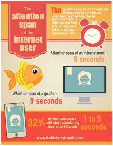
This infographic shows that attention spans online are shorter than ever - which is why it's so important to make your content emphasize your points effectively on different platforms. Image found here: http://www.huckleberrybranding.com/category/blog

This infographic shows that attention spans online are shorter than ever – which is why it’s so important to make your content emphasize your points effectively on different platforms.
Image found here: http://www.huckleberrybranding.com/category/blog

Many newspapers will now cover the essentials of a story immediately for their websites and mobile apps, and then write a more in-depth story later to be published on media for which readers tend to have longer attention spans.

This trend keeps in mind the way to design differently for each platform, and allows readers to get what they want out of your various applications.

In fact, The New York Times has a set of staff dedicated to designing content for their mobile app NYT Now, which gives bullet points of stories and links to the longer articles on the website.

  • Phone – Readers on this screen have shorter attention spans, about 3 minutes, and would therefore need more truncated and bullet-pointed design.
  • Tablet – Readers here have more engagement, have more time to spend, and are looking for more entertainment than on phones.
  • Online – You want to encourage engagement and sharing, and must also write for “continual partial attention,” meaning thoughtful use of subheads and bullet points to encourage readers to continue reading.
  • Print – These readers can’t interact as immediately as with the other media, and this reader has already invested in your content by the time they have the print version in their hands, so you can go more in-depth. You still want to encourage engagement with your brand, however.

As Garcia and Clark say, “Digital news is the raw meat; print is the cooked meat.”

While Twitter and blogs are fantastic for giving an impression of the raw meat of a story, you don’t want to lose sight of how the whole dinner will come together.


[social_share style=”circle” align=”horizontal” heading_align=”inline” text=”Don’t forsake the real meat of a story — more SXSW takeaways @NewMediaProf” heading=”Insightful? Share with your followers now” facebook=”1″ twitter=”1″ google_plus=”1″ linkedin=”1″ pinterest=”1″ /]

While this session was strongly tied to multimedia from a publisher’s perspective, what takeaways do you see for your brand? Looking forward to your seeing perspective in the comments.

[cta id=”4888″ align=”none”]